Aspire: to direct one’s hopes or ambitions towards achieving something. To long, aim, or seek ambitiously; especially for something great or of high value.
Aspire represents innovation, dedication, and change. We are unique and represent a bright future in the music industry, therefore our branding must also reflect that. This is shown by our 3 logos; our icon/symbol, our logotype/font, and our full insignia.
Our icon logo is an upward-pointing arrow, with a sweeping movement from left to right also representing forward motion. Making use of both shades of Aspire Gold, this logo makes a statement.
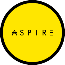
Our 2nd logo is a hybrid wordmark/emblem where font is preferred. Custom font represents how nothing about us is ordinary, and stylized lettering in the beginning and end. We borrow from the Japanese Yen also representing our global reach.
BRANDING
Our combination logo merges the wordmark emblem with soaring wings, and our banner. Tangible tactile merchandise will likely be the use case for this logo.
insignia
PRIMARY COLORS
ASPIRE BRIGHT GOLD
RGB : rgb(255, 230, 0)
HEX : #FFE600
ASPIRE GOLD
RGB : rgb(253, 212, 0)
HEX : #FDD400
YELLOW
RGB : rgb(255, 255, 0)
HEX : #FFFF00
SECONDARY COLORS
ASPIRE GRAY
RGB : rgb(40, 40, 42)
HEX : #28282A
ASPIRE DARK GRAY
RGB : rgb(28, 28, 29)
HEX : #1C1C1D
ASPIRE TEAL
RGB : rgb(26, 76, 76)
HEX : #1a4c4c


